GITHUB
Intro
Billions around the world have been directly affected by the Coronavirus. Folks have lost family members, jobs, and much, much more.
It is a difficult task to truly quantify the Coronavirus’s overall impact.
By nature of focusing on the economy, I will undoubtedly miss many important consequences from the virus.
However, as I manage my personal portfolio through this pandemic, it will be particularly valuable to, at the very least, stay in touch with many of the important macroeconomic indicators.
It has been shown that a few important macroeconomic indicators have statistically significant relationships with the stock market.
Thus, by tracking some of the important macroeconomic indicators in real time, I can adjust my personal portfolio as needed.
Before embarking on the this project, I had a couple primary goals in mind.
- Utilize a new visualization library/package/tool
- Breadth over depth (provide REAL value, not just another project)
Having studied Macroeconomics with Professor Allen Sanderson, I was well equipped to narrow down a few of the most important macroeconomic indicators.
I decided on Real GDP, Unemployment (U-3), Personal Consumption Expenditures, US Public Debt, Federal Funds Rate, and Money Supply (M2).
FRED API
Having studied economics at the University of Chicago, I am quite familiar with Federal Reserve Economic Data (FRED), a great resource for US economic data.
I went over to the FRED API which would allow me to retrieve the relevant economic data.
Using the requests library in python, I could easily send an HTTP request to the FRED API asking for data on each specific macroeconomic indicator.
Here is an example of requesting Real GDP from the API:

This returns the data in Javascript Object Notation (JSON) format, a very common and lightweight format often used to store and send data back and forth.
Data Cleaning
After converting the data to JSON format, I converted the relevant data to a dataframe, which is essentially a table with columns and rows and is often used in Python and R to work with data.
I used the python library pandas, a popular and easy-to-use data analysis library.

Storing the data in a dataframe will make it easy to organize and eventually graph all the data.
Data in the real world is never clean, so there were some manipulations needed to be done. I won’t go into detail on the specific data manipulations here, but most notably, I converted a few different column types, filtered out values that did not make sense, and adjusted the scale for particular values.
If you want further detail, check out my code.
Dash
After I had a fairly strong grasp of the FRED API and cleaned all the relevant data, I wanted to get a feel for Dash and Plotly.
I quickly jumped into the tutorial which was very helpful for getting up and running quickly.
Side Note: Within the past year I have completed the Flask, FastAPI, Django, and Next.js tutorials and they have all been extremely useful and practical. Documentation and the associated tutorials for frameworks and libraries in software have continued to get better and better.
In a Dash app, there are primarily two parts: the layout and the …..
The layout does exactly what it sounds like: it allows you to describe the layout of the app using html components which are rendered through the React.js library.
In Dash, there is a component called Graph that renders interactive data visualizations using plotly.js.
I will use the Graph component to render a graph of each macroeconomic indicator, but I must first define figures to that correspond to each chart.
The Graph component has a figure argument which is the same figure argument used in plotly (a python open source graphing library). I know, this is a lot of “plotlys.” To clarify, there is a javascript plotly.js and a python plotly.py.
Thus, I defined a line graph for real GDP as below.

I then referenced the fig1 (real GDP figure) when defining graph1 as seen below.

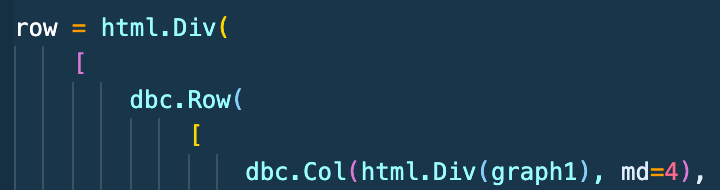
Below, I simply created the first row and column using html components in dash to display my corresponding Real GDP graph.
Finally, I created a header and also used the row I defined above in the layout portion of the Dash app!

I then repeated a similar work flow as above for all my other five macroeconomic indicators and their graphs!
Again, please find my associated code and repo here if you want to go into more detail.
Graph Interactivity

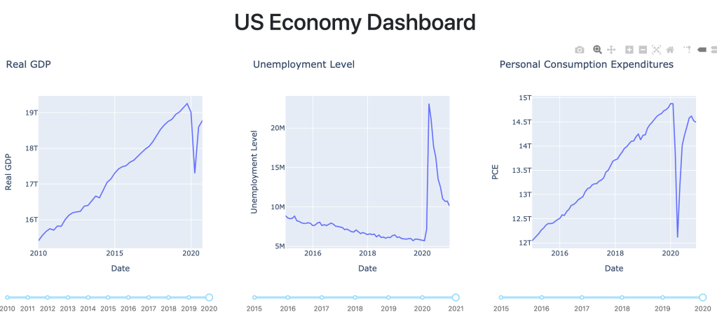
In the screenshot above, the real GDP chart has a year slider on the x-axis that will adjust the graph display based on the years selected.
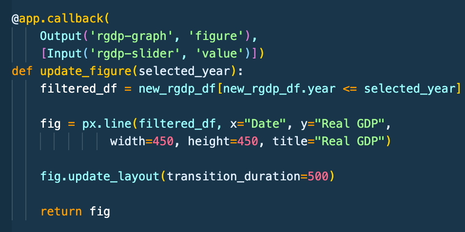
In order to implement an interactive graph, Dash allows for callback functions that automatically get called when an input property’s component changes.
Below, I wrote a decorator that tells Dash to call the update_figure function whenever the year slider on the real GDP graph changes.
Within the function, I am utilizing pandas to create a new dataframe with only the years selected from the years slider.
Thus, whenever the years slider for the real GDP graph changes, Dash will call this function, create a new dataframe with the specified years, and update the graph display accordingly.
Pour Conclure
Not too bad right? If you made it all the way down here, I appreciate you and hope it was helpful!
Again the associated code is here and the demo is here (the demo may be slow as heroku unloads the application from the server memory if it is unused for a long time).
As far as project improvements, adding additional measures such as interest rates, median income and much more could be added. Additionally, slicing data by different demographics, tracking the number of jobs, and a whole lot more could be done.
Maybe for another day. Thanks for reading and let me know what you think! Feel free to email me at abhin@abhin-sharma.com. I’d love to hear your thoughts, questions, or any feedback.
